Types
 0Christmas pattern is one of the most commercially reliable seasonal pattern categories in surface design. The seasonal and gift-driven purchasing cycle creates consistent demand for Christmas pattern across wrapping paper, fabric, stationery, homeware, and holiday apparel - with new designs produced annually by retailers and pattern designers. The category is characterised by a stable core motif vocabulary with significant variation in style, from traditional and heritage treatments through to contemporary, minimal, and novelty approaches.
 0Ghost pattern is a conversational/novelty print type defined by its motif: the ghost - a simplified, typically friendly or cute figure drawn from Halloween and popular culture iconography. In surface pattern design, ghost patterns appear most actively in seasonal Halloween product ranges: children's apparel, home textiles, wrapping paper, party supplies, and stationery. A separate but related use of "ghost pattern" in graphic and digital design refers to a faint, low-contrast background texture - a subtle pattern using near-matched tones to add visual depth without distracting from foreground content.
 0Halloween pattern is a major commercial category in the seasonal surface design market, ranked alongside Christmas and Easter as one of the three biggest seasonal pattern opportunities. The commercial window runs from August through October, giving designers significant lead time for seasonal product. The market has segmented significantly in recent years - the traditional orange-and-black children's aesthetic is now just one of five recognised commercial directions, with adult-targeted pastel Halloween, vintage, and witchy/cottagecore aesthetics commanding significant and growing market share. Origins in the Celtic festival of Samhain (c. 1st century BC) provide a deep symbolic vocabulary that designers continue to draw from.
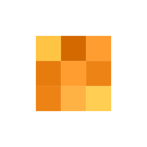 0Orange is a secondary colour formed midway between red and yellow on the colour wheel; its complementary colour is azure (blue). In surface pattern design, orange is a high-energy, high-warmth colour with strong seasonal associations (autumn and Halloween) and cultural associations with warmth, vitality, and creativity. The orange spectrum is commercially divided into red-orange (burnt orange, pumpkin, persimmon), yellow-orange (marigold, saffron), and neutral orange (cantaloupe, apricot, peach) sub-groups, each carrying distinct aesthetic and market associations. Notably, the fruit came before the colour name in English - the word "orange" was used for the fruit centuries before it was applied as a colour designation (16th century).
 0Red-based surface patterns derive their impact from the hue's unmatched visual weight and cross-cultural symbolic charge. Red is the colour with the longest wavelength visible to the human eye and is among the first colours human vision distinguishes. In surface pattern design, red functions both as a high-energy ground and as a powerful accent, with multiple symbolic registers - from romance and celebration to danger and power - making it one of the most commercially versatile colour directions.
 0Snow patterns in surface pattern design are primarily driven by the snowflake motif and its variants. The snowflake is one of the most geometrically distinctive natural forms - its strict sixfold symmetry, intricate branching, and infinite variation within a fixed structural rule make it an enduringly rich source for surface pattern. Snow patterns are strongly seasonal, with commercial demand concentrated in autumn/winter product ranges, Christmas collections, and winter homeware.
You've reached the end
6 Types