Types
 0Halloween pattern is a major commercial category in the seasonal surface design market, ranked alongside Christmas and Easter as one of the three biggest seasonal pattern opportunities. The commercial window runs from August through October, giving designers significant lead time for seasonal product. The market has segmented significantly in recent years - the traditional orange-and-black children's aesthetic is now just one of five recognised commercial directions, with adult-targeted pastel Halloween, vintage, and witchy/cottagecore aesthetics commanding significant and growing market share. Origins in the Celtic festival of Samhain (c. 1st century BC) provide a deep symbolic vocabulary that designers continue to draw from.
 0Ice cream patterns sit within the broader novelty and conversational print category: designs whose motifs carry immediate associative meaning rather than abstract visual interest. Ice cream imagery is commercially embedded in summer seasonal product lines, children's products, and food-service contexts. The motifs are universally legible and carry strong positive associations - leisure, summer, sweetness - making them commercially durable across a range of applications and price points. The pattern type spans from simple tossed scatter repeats of single-colour cone silhouettes to detailed illustrated arrangements combining multiple ice cream forms with supporting props (sprinkles, cherries, waffle textures, drip details).
 0Orange is a secondary colour formed midway between red and yellow on the colour wheel; its complementary colour is azure (blue). In surface pattern design, orange is a high-energy, high-warmth colour with strong seasonal associations (autumn and Halloween) and cultural associations with warmth, vitality, and creativity. The orange spectrum is commercially divided into red-orange (burnt orange, pumpkin, persimmon), yellow-orange (marigold, saffron), and neutral orange (cantaloupe, apricot, peach) sub-groups, each carrying distinct aesthetic and market associations. Notably, the fruit came before the colour name in English - the word "orange" was used for the fruit centuries before it was applied as a colour designation (16th century).
 0The polka dot is defined by its simplicity: equal-diameter circles at regular intervals against a contrasting ground. The pattern depends entirely on the interplay of dot size, spacing, and colour contrast rather than any figurative detail. It reads clearly at multiple scales and translates across virtually every product category, from fashion and childrenswear to home textiles and stationery.
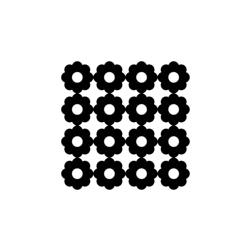 0Retro patterns are not a single pattern type but a stylistic mode that borrows visual conventions from earlier decades. In surface pattern design, "retro" typically references the aesthetics of the mid-20th century: the bold graphics and atomic motifs of the 1950s, the psychedelic colour and organic forms of the 1960s and 1970s, and the domestic print vocabularies of the immediate post-war period. The defining characteristic is intentional historical recall - the pattern signals its era of reference rather than trying to appear contemporary.
 0Rocket patterns belong to the space-theme category of novelty and conversational prints - a commercially durable children's product category alongside dinosaur, construction vehicle, and dinosaur motif patterns. The rocket's strong silhouette, cultural associations with adventure and exploration, and appeal to children's imagination give it reliable commercial traction in licensed and unlicensed product design. The aesthetic splits into two dominant traditions: the retro-futuristic style (drawing on 1950s-1960s science fiction illustration and Space Age design, featuring bullet-shaped metallic rockets with fins and flames), and the contemporary cartoon style (simplified, friendly forms suited to infant and younger children's products).
 0Space patterns draw on astronomy and science-fiction aesthetics for decorative surface design, using the visual vocabulary of the night sky and space exploration as motif material. The category spans a wide stylistic range - from precise star-chart illustrations to cartoon rocket ships, from photographic nebula-inspired digital prints to mid-century retro-futurist designs. In surface pattern terms, "space" most directly refers to this astronomical and sci-fi thematic category, not to the concept of negative space or spatial grid systems in design.
 0In surface pattern design, "vintage" refers to patterns that authentically originate from or are designed to closely replicate the aesthetics of an earlier era, most commonly the 1920s through 1970s. The term is distinct from "retro" - which refers to contemporary designs consciously invoking past aesthetics - though the terms overlap in commercial usage. Vintage patterns carry the design conventions, print technologies, and colour palette limitations of their period of origin, giving them a distinctive quality that is difficult to precisely replicate digitally.
You've reached the end
8 Types