Pink is a broad colour family encompassing all light tints of red with varying saturation - from the palest pastel pink through soft coral and warm salmon to vivid hot pink and deep rose. In surface pattern design, pink spans a wide range of commercial positioning: pale pink is associated with femininity, softness, and infant products; bright hot pink with boldness and pop energy; dusty rose with heritage and nostalgia; and millennial pink with a specific 2010s-2020s cultural aesthetic of calm sophistication and gender-inclusive design. The commercial range of pink in surface pattern is wider than any simple "feminine" classification suggests.
We use cookies to improve your experience and understand how PatternDesigners is used.
Pink is a broad colour family encompassing all light tints of red with varying saturation - from the palest pastel pink through soft coral and warm salmon to vivid hot pink and deep rose. In surface pattern design, pink spans a wide range of commercial positioning: pale pink is associated with femininity, softness, and infant products; bright hot pink with boldness and pop energy; dusty rose with heritage and nostalgia; and millennial pink with a specific 2010s-2020s cultural aesthetic of calm sophistication and gender-inclusive design. The commercial range of pink in surface pattern is wider than any simple "feminine" classification suggests.
Pink registers visually as warm and soft at pale saturation levels, energetic and bold at vivid saturation. The undertone is critical to commercial positioning: cool pinks (with blue undertones) read as sophisticated and modern; warm pinks (with yellow/orange undertones like salmon and coral) read as earthy and summery; neutral pinks (balanced undertones) are the most commercially versatile. The Pantone system provides specific standards: Barbie Pink = Pantone 219C; Rose Quartz = Pantone 13-1520 (Colour of the Year 2016).
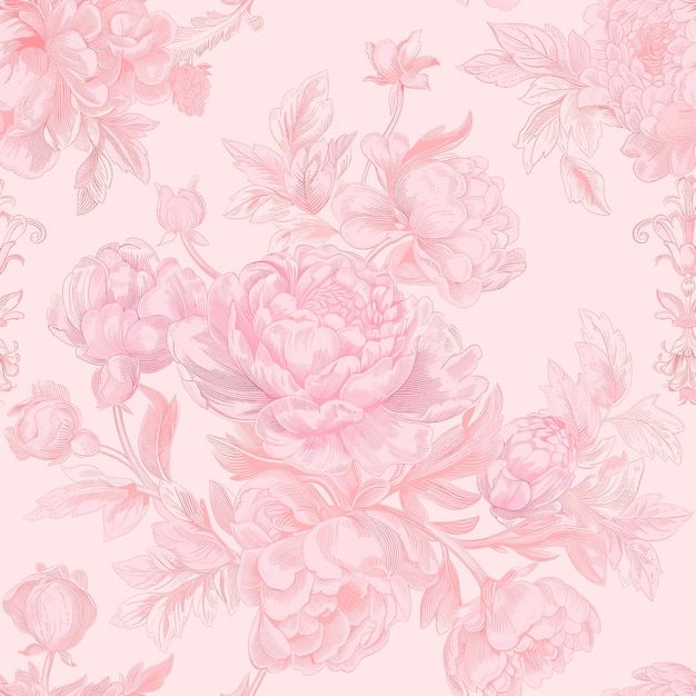
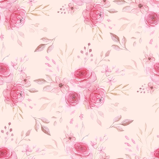
Pink functions as a colour applied to any pattern structure. Pink-dominant surface design is most commercially active in: floral and botanical pattern (rose, peony, cherry blossom compositions); children's textile pattern (soft pink grounds with friendly motifs); gift and stationery design; and contemporary minimal pattern (isolated motifs or geometric forms on pale pink ground).
Pink is most strongly associated with:
Documented named pink shades with design relevance:
Soft/pale pinks:
Floral pinks:
Warm pinks:
Bright/vivid pinks:
Culturally significant pinks:
Pink's cultural associations have shifted significantly across history. In the 18th century, pink was a gender-neutral colour used in both male and female dress. The association of pink specifically with femininity and female children developed through the early-to-mid 20th century in Western consumer markets. The 1950s-1960s saw the consolidation of pink as a primarily "feminine" marketing colour. From the 1990s onwards, design culture has increasingly challenged this constraint - Elsa Schiaparelli's Shocking Pink (1937) asserted pink as a bold, powerful fashion statement; the millennial pink phenomenon of the 2010s explicitly repositioned pale dusty pink as gender-neutral and sophisticated. The Plochere Color System (1948) - used by American interior designers - was an early formal colour system that included systematic pink classification.
Pink is a broad colour family encompassing all light tints of red with varying saturation - from the palest pastel pink through soft coral and warm salmon to vivid hot pink and deep rose.
Pink registers visually as warm and soft at pale saturation levels, energetic and bold at vivid saturation.
Colour
Pink functions as a colour applied to any pattern structure.
Kawaii
Pink's cultural associations have shifted significantly across history. In the 18th century, pink was a gender-neutral colour used in both male and female dress. The association of pink specifically with femininity and female children developed through the early-to-mid 20th century in Western consumer markets.
Floral Pattern, Flower Pattern, and Botanical Pattern